Creative Generated: Poster - Personal Project
Typographic treament
Creative Generated: Logo Design for V Evolution web game
Brief: Logo designed to incorporate the V logo as well as relate to the three worlds the V Evolution game revolves around.
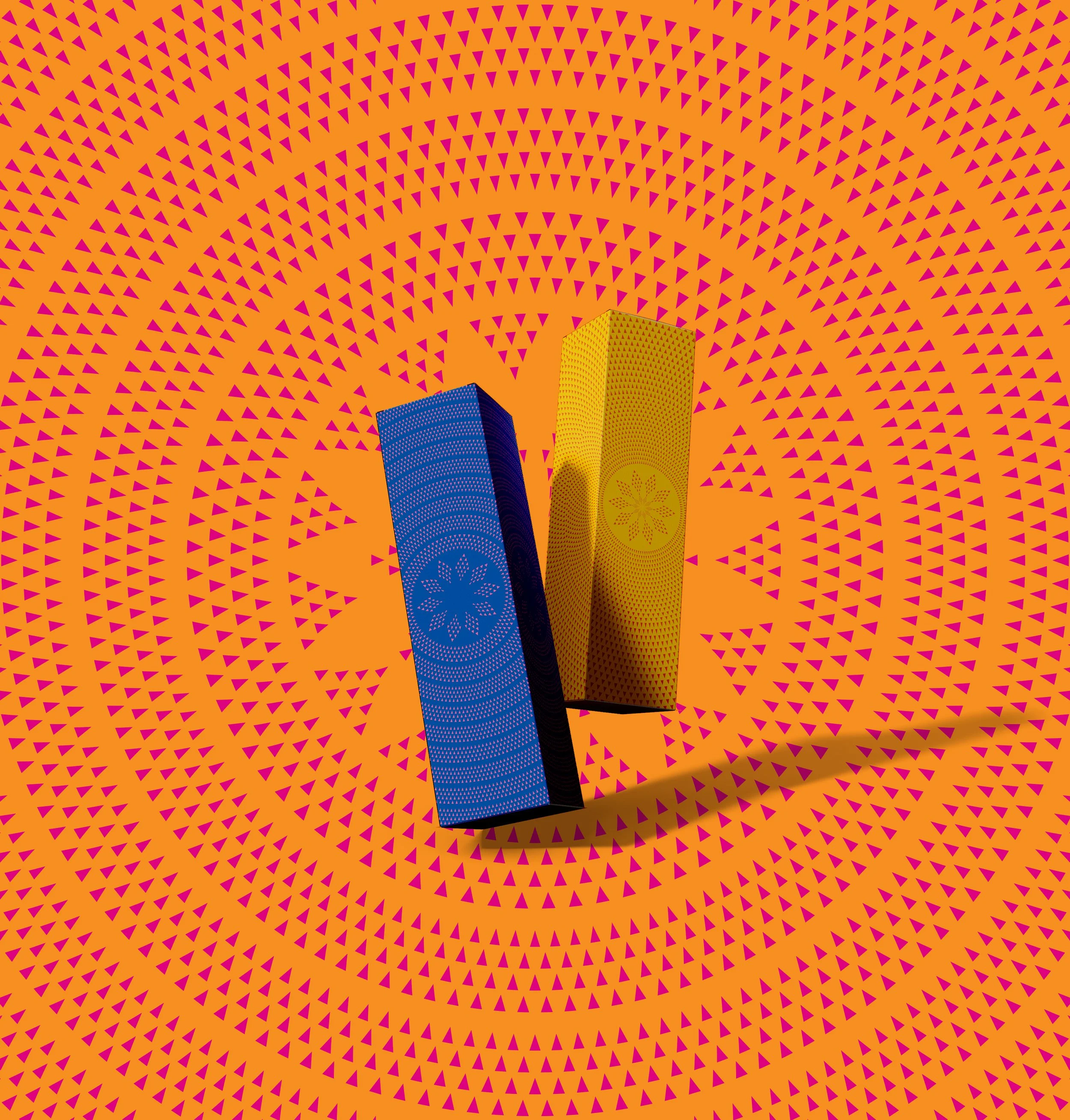
Vaione is a premium small-batch gin born from Niue, distilled with care, connection, and cultural pride. Developed for the Niue Government, this project set out to create a world-class spirit brand that could authentically represent the island while standing proudly on the global stage. The result is a design that embodies rarity, legacy, and mana, a gift that carries the spirit of Niue.
The Challenge
Develop a luxury gin brand that feels authentically Niuean, balancing island identity with premium design cues.
Design a collectable packaging system that tells the story of Niue’s craftsmanship, heritage, and exclusivity.
Position the product as “Only on Niue” rare, refined, and grounded in place.
The Approach
Drew inspiration from Lalaga Niue, the traditional art of weaving, particularly the Lili mat, a symbol of patience, care, and connection.
Treated each design element as a woven thread — interlacing story, craft, and cultural identity into one seamless piece.
Framed Vaione not just as a spirit, but as a gift of Niue — something to be treasured and shared with mana.
Infused storytelling throughout the brand, from the name to the tactile packaging, grounding it in ancestry and environment
The Solution
Brand Story: The name Vaione combines Vai (water — life-giving and pure) and One (land and connection), expressing the balance between nature and heritage.
Packaging Design: Gift box inspired by Lili mat weaving, featuring embossed textures and interwoven lines representing unity and tradition.
Tagline: “Only on Niue” — a declaration of authenticity, rarity, and origin.
The Outcome
Delivered a premium, culturally grounded brand that celebrates Niue’s heritage while elevating its craftsmanship to an international standard.
The product became both a collector’s item and a cultural statement, honouring Niue’s artistry and exclusivity.
Reinforced Niue’s position as a small island capable of producing world-class products with integrity, depth, and mana.
Moana Pasifika is more than a Super Rugby franchise, it is a movement for and by Pasifika people, designed to uplift communities, showcase our culture, and inspire the next generation. SixOneNine was engaged to help craft a brand identity that not only represents a professional sports team but also embodies a cultural wave of pride, service, and connection across the Pacific.
The Challenge
Create a world-class sports brand that resonates with Pasifika communities globally.
Build a system that balances cultural
depth with the commercial needs of a professional franchise.
Develop a visual identity and jersey design that embodies the strength, unity, and oceanic identity of Moana Pasifika.
The Approach
Anchored the brand in the ocean as connector, drawing from Epeli Hau’ofa’s philosophy that we are defined by the greatness of our oceans, not the smallness of our islands.
Wove together motifs and elements from across Pasifika, tatau, tapa, ngatu, hiapo to symbolise unity.
Integrated a bilingual and multilingual approach, championing Pasifika languages in brand voice.
In the first year, I set up an internal creative team managing all communications, from photoshoots, film, and in-stadium content to game-day creative, signage, sponsorship initiatives, and brand campaigns.
The Solution
Logo/Mark: Sun, land, and sea woven together, the sun filled with tatau motifs radiating energy, the land symbolising Pasifika islands, the moana represented with whale-tail currents and abundance.
Jersey Design: Adorned with Pasifika motifs, centred around an abstract Polynesian sail to reflect navigation, leadership, and mastery of both ocean and rugby.
Brand Voice: Hybrid approach using Pasifika languages alongside English, making communication inclusive and authentic across communities and global audiences.
The Outcome
Established a unique brand system for the world’s first professional rugby team created for Pasifika, by Pasifika.
Jersey and brand identity celebrated as bold, unapologetic, and deeply cultural, resonating with both grassroots communities and international fans.
Built an internal creative function that enabled Moana Pasifika to control its own storytelling, elevate game-day experiences, and create consistent, high-impact content across every platform.
Moana Pasifika brand continues to serve as a cultural and sporting anchor, amplifying Pasifika pride and identity on a global stage.
Tauihi Basketball Aotearoa represents a new era for women’s basketball in Aotearoa. More than a league, Tauihi is a platform for visibility, excellence, and aspiration. It elevates wāhine in sport and creates a stage worthy of their talent.
The name Tauihi speaks to ascension, to rising upward, to reaching higher. This brand was built to reflect that momentum. Bold, unapologetic, and distinctly grounded in Aotearoa.
The Challenge
Develop a new national league identity that positions women’s basketball as elite, modern, and culturally rooted.
Create a brand that feels uniquely Aotearoa while being strong enough to stand alongside international leagues.
Build a visual system adaptable across digital, broadcast, merchandise, uniforms, and stadium environments.
Ensure the brand carries mana, reflecting both athletic excellence and cultural integrity.
The Approach
Anchored the concept in the meaning of Tauihi, to rise, to elevate, to ascend.
Designed a bold and contemporary identity system that balances strength and fluidity, echoing movement on court and cultural depth.
Drew on subtle Māori visual language to create a brand that feels indigenous to Aotearoa without becoming tokenistic.
Focused on high impact typography and confident form making to position the league as serious, elite sport.
Developed a cohesive system that could stretch across team identities, competition branding, and campaign storytelling.
The Solution
The core identity centres around a strong, modern wordmark that communicates upward momentum and elevation. The angular yet dynamic letterforms suggest movement, drive, and athletic power, reflecting the intensity and precision of the game itself.
The visual language is built on a bold colour palette designed for broadcast visibility and digital impact. Graphic framing devices echo ascension and structure, while high contrast compositions command attention across social platforms and stadium environments.
Culturally, the brand subtly embeds Aotearoa identity through proportion, rhythm, and visual cadence. The upward energy of the system mirrors both the meaning of the name Tauihi and the rising trajectory of women’s basketball in New Zealand.
The identity was designed to perform across a wide range of applications, including league lockups and team system integration, digital graphics and broadcast overlays, social media content, event collateral, merchandise, and environmental branding.
The Outcome
Tauihi launched as a bold new presence within New Zealand sport, signalling a confident future for women’s basketball.
The brand positioned the league as elite from day one, not emerging but arrived.
The identity system provides flexibility for growth, allowing Tauihi to evolve season after season while maintaining consistency.
Most importantly, the brand reflects the calibre, resilience, and rising trajectory of wāhine athletes across Aotearoa.tangible way.
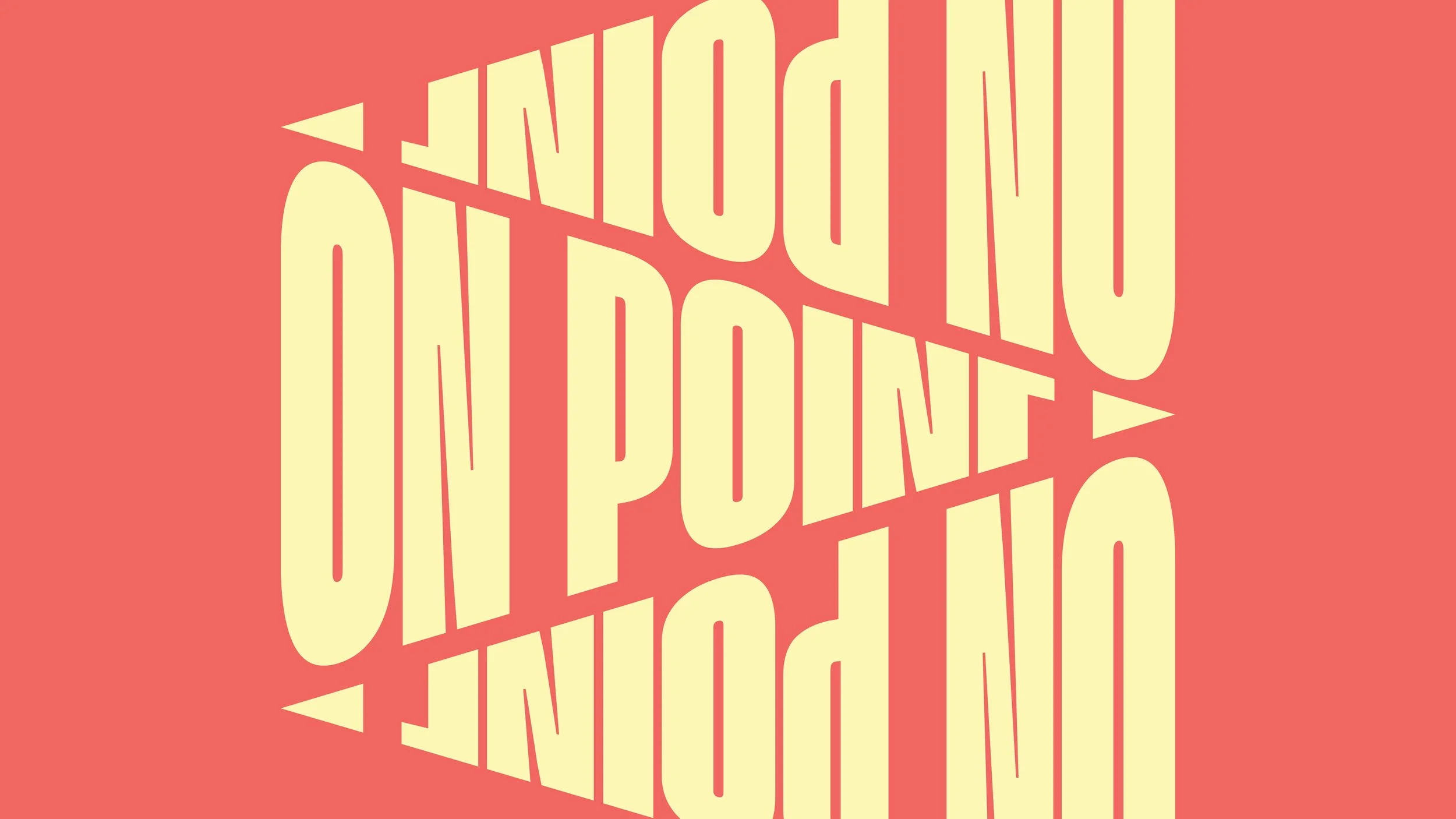
Creative Generated: Typographic Design
Brief: Design the type treatment for the skatepark LED scoreboard
On Point is a programme created to support young people through sport, wellbeing, and community connection. Partnering with ACC, the initiative needed a bold identity that could cut through youth culture, capture their energy, and empower them to see sport as a pathway for growth and resilience. I developed a brand system that combined precision, movement, and cultural relevance to bring this kaupapa to life.
The Challenge
Design a brand identity that feels fresh, dynamic, and instantly recognisable to youth audiences.
Balance the serious kaupapa of injury prevention and wellbeing with an engaging, aspirational aesthetic.
Create a flexible system that works across schools, sports clubs, events,
and digital platforms.
The Approach
Built the visual language around precision and focus, using forward-leaning typography and arrow motifs to represent movement and progress.
Designed the brand to have no limits — the logo itself could be rotated, stacked, and repurposed into bold patterns.
Established imagery guidelines that included grading, noise overlays, and creative effects (e.g. mirror effect) to elevate even everyday photos into striking visuals.
The Solution
Logo: A bold, slanted wordmark symbolising precision, progress, and ambition, with a flexible system for playful adaptations.
Colours: Crafted a vibrant colour palette, to resonate with youth culture and modern design trends.
Imagery: A distinctive visual style using grading, lifted highlights, and noise overlays, with a “mirror effect” for hero campaign imagery.
The Outcome
Delivered a brand that feels sharp, youthful, and unapologetic, resonating strongly with young people while carrying the mana of the kaupapa.
Provided ACC and On Point with a flexible, future-proof brand system that can grow alongside the programme.
Set up a visual style that empowers schools, clubs, and communities to use the brand creatively without losing consistency.
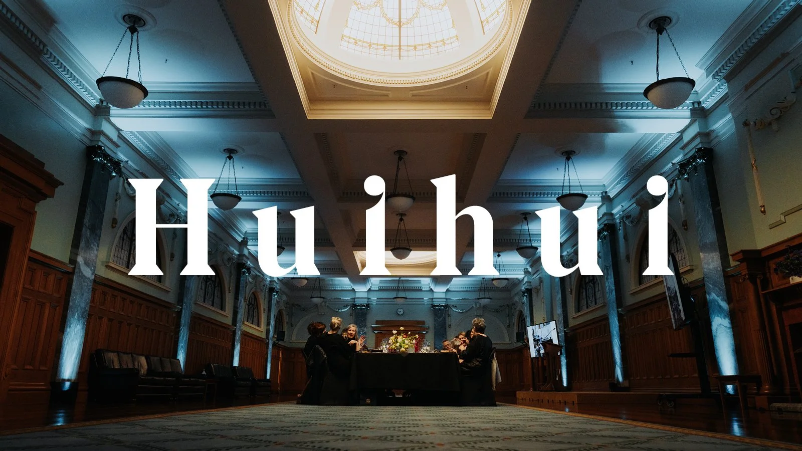
Huihui are the food, function, and event specialists for New Zealand Parliament. The name ‘Huihui’ means ‘to gather’ a reflection of their role in bringing people together to share food, conversation, and unforgettable experiences inside some of the most significant spaces in Aotearoa, including the Beehive and Old Parliament buildings. I was tasked with creating a sophisticated, flexible identity that honours Parliament’s mana while welcoming everyone to the table.
The Challenge
Develop a brand that feels professional, timeless, and elegant while still being warm and inviting.
Balance the gravitas of Parliament with a contemporary hospitality aesthetic.
Ensure the identity works seamlessly across a wide range of applications, from menus and signage to uniforms, glassware, and press ads.
The Approach
Anchored the visual system in the idea of gathering and connection, expressed through the brand name and identity.
Introduced the Huia feather frame device - symbolic of mana, dignity, and service, to frame communications with a unique, instantly recognisable motif.
Developed brand patterns and witty copy lines (“Order, order”, “All parties welcome”, “The best seats in the House”) to weave in subtle nods to Parliament’s heritage.
The Solution
Logo: A refined, versatile logotype designed for clarity and legibility across print and digital applications.
Tone of Voice: Professional, witty, and welcoming, using Parliament-inspired wordplay such as “Order! Order!” and “All parties welcome.”
Photography: A dedicated photoshoot inside Parliament showcasing the grandeur of the venue, the warmth of Huihui hospitality, and the fine detail of its food and service.
The Outcome
Delivered a brand system that communicates manaakitanga and professionalism while positioning Huihui as both authoritative and welcoming.
Helped Parliament’s hospitality offering stand apart as a world-class event service provider, serving guests from heads of state to local community groups.
Created a visual identity that is both timeless and adaptable, one that honours the formality of Parliament while remaining engaging and accessible to all.
Creative Generated: Full re-brand including logo, digital & social, stationary and office design.
Brief: Redesign the entire brand from start to finish - across all brand assets.
First viral video currently sits at 2.8 million views.
Creative Generated: Brand Campaign. Television Commercial. Art Direction. Design.
Brief: Design new brand campaign to promote AMI Insurance.
Korohihī Ao Korohihī Pō is more than a brand, it is a living kaupapa of reo revitalisation for Ngātiwai. I was engaged to create a visual identity that carried the heartbeat of the reo, expressing duality, whakapapa, and the journey from unseen to seen.
The Challenge
Develop a culturally grounded brand identity that honours Ngātiwai worldview while engaging modern audiences.
Ensure the brand can live across platforms: guidelines, apparel, digital, social media, and podcast presence.
The Approach
Anchored design in Ngātiwai narratives: Ao & Pō, Whakapapa, and Moana.
Drew on traditional forms such as unaunahi (fish scales) to express unity, strength, and continuity.
Crafted a bilingual, flexible system that balanced bold cultural expression with clarity and accessibility.
The Solution
Wordmark: Inspired by the flowing waters of Ngātiwai, fluid arcs and rhythmic forms reflect movement and life.
Colour System: Two-tone pairings symbolising the horizon, where light meets dark, sea meets sky, past
meets future.
The Outcome
Delivered a comprehensive brand guideline ensuring long-term cultural and visual integrity.
Created a living identity that Ngātiwai can use across platforms to revitalise and celebrate their reo.
Recognised for its balance of tradition and innovation, showing how
indigenous worldviews can inform contemporary design.
Illustration Print
Ruaitewānanga is the visual embodiment of IAG’s commitment to understanding and walking alongside Māori. Developed as part of He Rautaki Māori, IAG’s Māori Strategy, this design serves as a vessel of learning, a bridge between Māori and non-Māori worldviews built on respect, partnership, and collaboration.
The name Ruaitewānanga comes from the Māori belief system used in traditional Whare Wānanga (houses of higher learning), representing the pursuit of knowledge, understanding, and connection. Through this kaupapa, the design honours IAG’s ongoing journey to embed cultural awareness and inclusion at every level of the organisation.
The Challenge
Create a cultural design narrative and visual identity that symbolises IAG’s journey toward deeper engagement with Māori.
Develop an artwork that acts as both a teaching tool and a symbol of collaboration, connection, and shared prosperity.
Build a design system that can be used across communications, spaces, and strategy materials while maintaining integrity and meaning.
The Approach
Collaborated closely with artist Randal Leach (Ngāti Porou, Ngāti Konohi) to translate the kaupapa of He Rautaki Māori into a powerful visual form.
Drew on the concept of Ruaitewānanga — the vessel of learning — to represent the flow of knowledge between worlds.
Grounded the artwork in traditional Māori principles such as whanaungatanga (relationships), manaakitanga (respect and care), kaitiakitanga (stewardship), and rangatiratanga (leadership).
Used circular and rippling forms to symbolise the spread of understanding, like a stone dropped into water, radiating knowledge and growth.
Crafted a supporting colour system inspired by Te Ao Mārama, balancing depth and light to represent enlightenment and progress.treasured and shared with mana.
The Solution
Core Artwork: Central circular motif representing Ruaitewānanga, a vessel of learning expanding outward, symbolising shared knowledge and collaboration.
Visual Language: Fine linework and koru-based symmetry evoke manaia forms (guardians), connecting past, present, and future.
Tone of Voice: Empowering, aspirational, and grounded in unity, designed to speak to both Māori and non-Māori audiences with respect.
Applications: Strategic documentation, presentation systems, internal learning tools, and environmental graphics across IAG’s offices.
The Outcome
Ruaitewānanga has become a symbol of IAG’s Māori Strategy, used to visually and conceptually anchor He Rautaki Māori.
The artwork serves as an ongoing reminder of IAG’s commitment to learning, inclusion, and partnership with Māori.
Beyond visual identity, it functions as a framework for storytelling and engagement, helping staff connect with the kaupapa in a tangible way.
Logo. Print. Used for the fashion week campaign
Creative Generated: Print Lock-up. Layout of Print Campaign.
Brief: Design a logo lock-up for the Auckland restaurant month campaign.
Creative Generated: App design. Receipt design. Print.
Brief: Design the interface for the App for TVNZ.
Interactive ‘Lie Detector’ used to promote the show.
Label design. Limited edition gun bottles were used to promote the launch of Weed Weapon.
Creative Generated: Pint. Outdoor media campaign.
Brief: Develop the nation wide outdoor brand campaign for Chorus broadband.
A mixture of photography and 3D CGI. I worked on the art direction, retouching and typography.
Art Direction. UI Design. Photoshoot. I helped redesign the NZI website and also organised and art directed the photoshoot for the images used in the site.
Photographer Credit - Simeon Patience. The Collective Force.
Cover. Magazine Design. The cover is screen-printed.
Logo lock-ups. Designed for the in store menu boards
Creative Generated: Print. Posters. Banners.
Street Posters. These were the original designs. But we ended going with a simplified direction.
Packaging design. Mini rebrand for Orchard Thieves Cider.
Gates. Logo. The gates are used at diff erent events around Auckland. While the simplifi ed logo version is used on all HOC campaigns.
Art Direction. Photography. I art directed and organised a photoshoot for IAG New Zealand, focused on its staff and the way they work. Shot in multiple locations through out the country.
Photographer Credit - Paul Ross Jones.
Logo. Print. Brand Guidelines. I helped develop the entire look and feel.
Type. Layout. Based on the classic school eraser.
Lock up. Packaging.
Type. Poster.
Type treatment. For Auckland’s keep it clean campaign.
Print. Used to promote seatback entertainment.
Typography. Retouching.
Valentine’s Card. Typorgraphy.
Websites, Mobile Apps, EDMs & Banners
Facebook App. Logo. Print Collateral. Burger Pro campaign for Carl's Jr.
Lock-up. Website. I designed the lock-up and helped with the look and feel of the site.